F
i
a
t

- Design
- Visual Design
- Ux Design
- Prototyping
- Motion
- Film
M
u
l
t
i
p
l
e
j
o
u
r
n
e
y
s
FCA asked to create a vision concept rethinking the car-buying process. After interviewing more than 50 people we understood when it comes to buying a car, every user follows a different path made of countless micro-moments. Our vision was to make sure the experience of every individual is integrated throughout these moments.
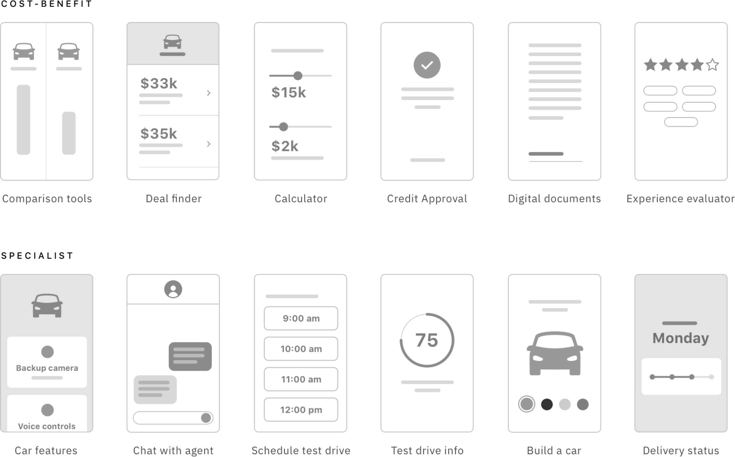
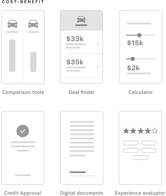
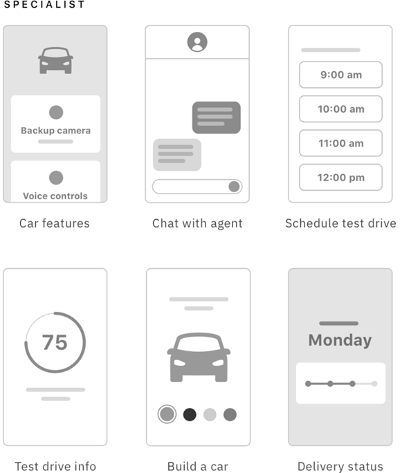
We identified the two most common user profiles: The Cost-benefit and The Specialist. We mapped a set of tools and features to address their pain-points.
We identified the two most common user
profiles: The Cost-benefit and The Specialist.
We mapped a set of tools and features to
to address their pain-points.
D
e
s
i
g
n
c
o
n
c
e
p
t
Working with a dedicated team on Huge, we developed the whole eco-system of FCA sales process, from the website, mobile apps, employee app, physical interactive totem, and the physical store layout entirely focused on bringing interactivity and mixing the digital with the physical world, creating the ultimate shop experience for cars, unifying Technology, Experience Design, Human-Centered design and a lot of fresh ideas.
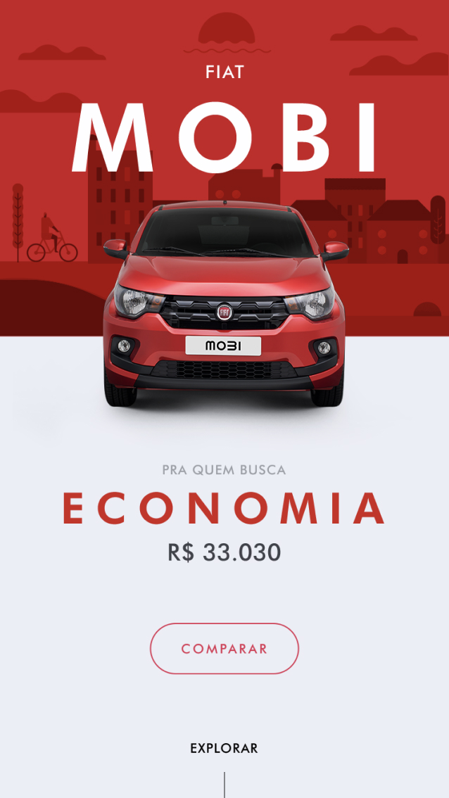
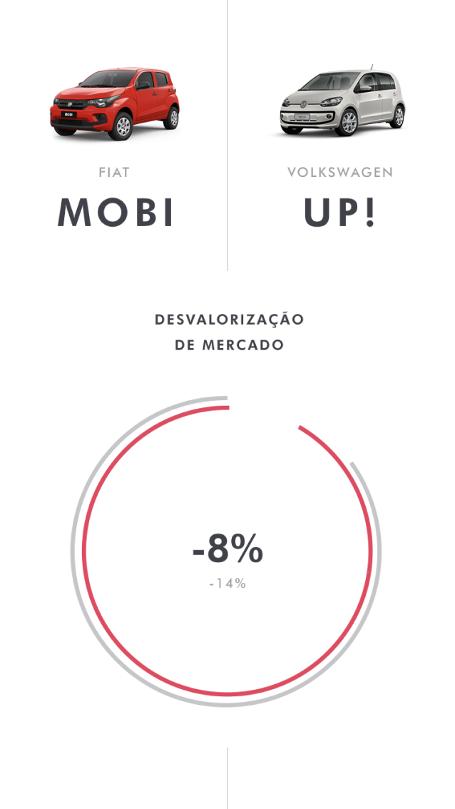

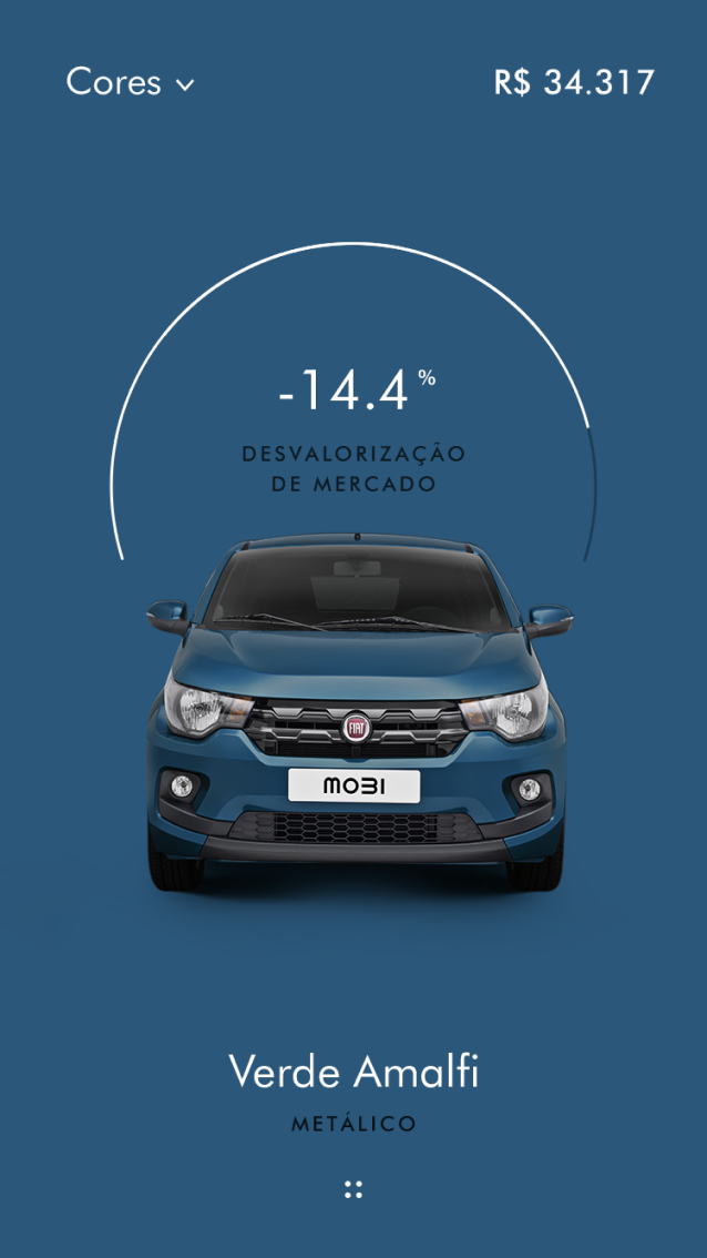
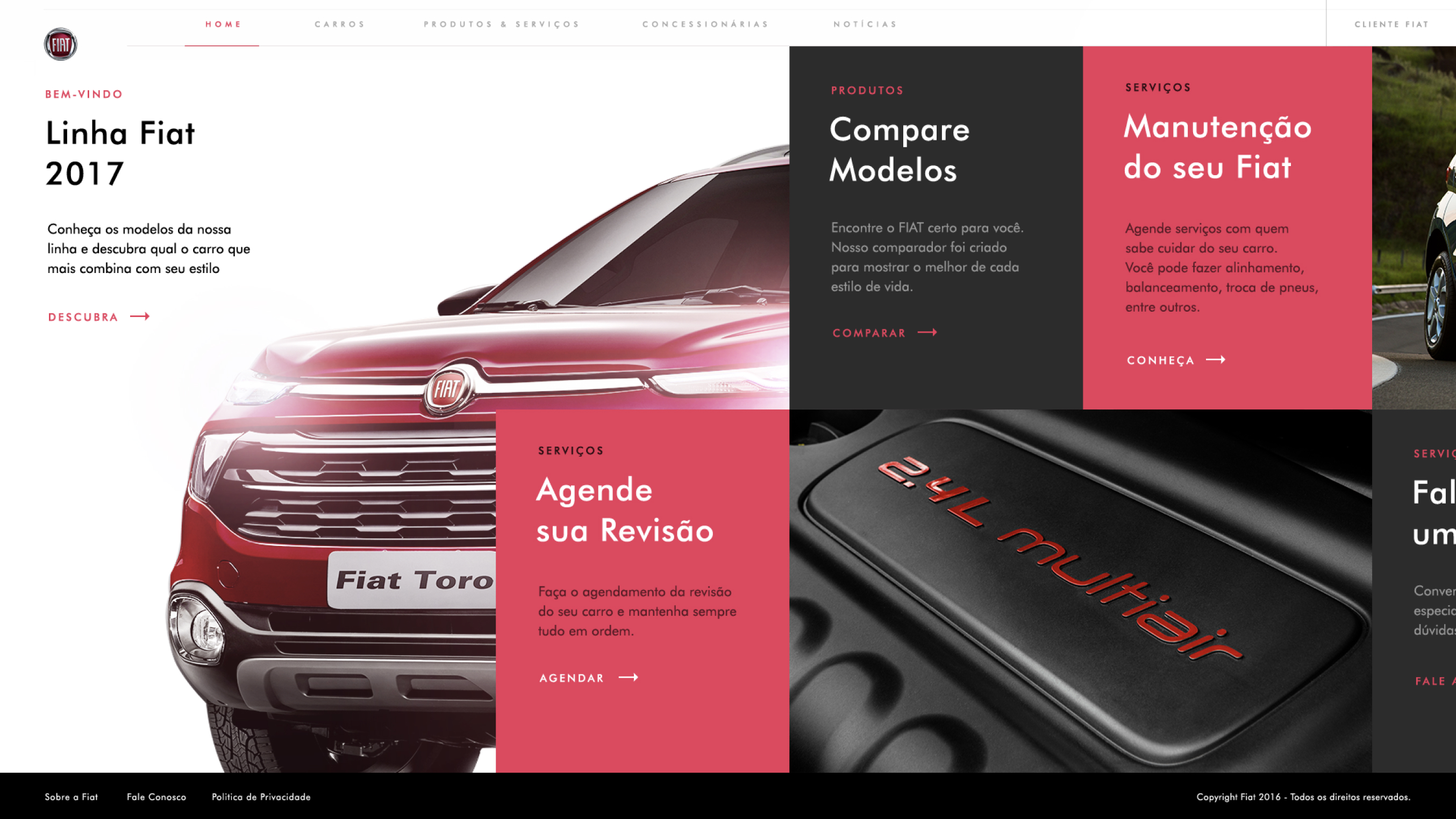
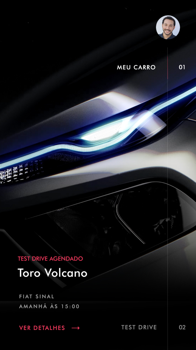
We build an exclusive app that personalizes and adapts the content depending on which car you want to buy. You can compare with other competitors, customize and have help all in one app.
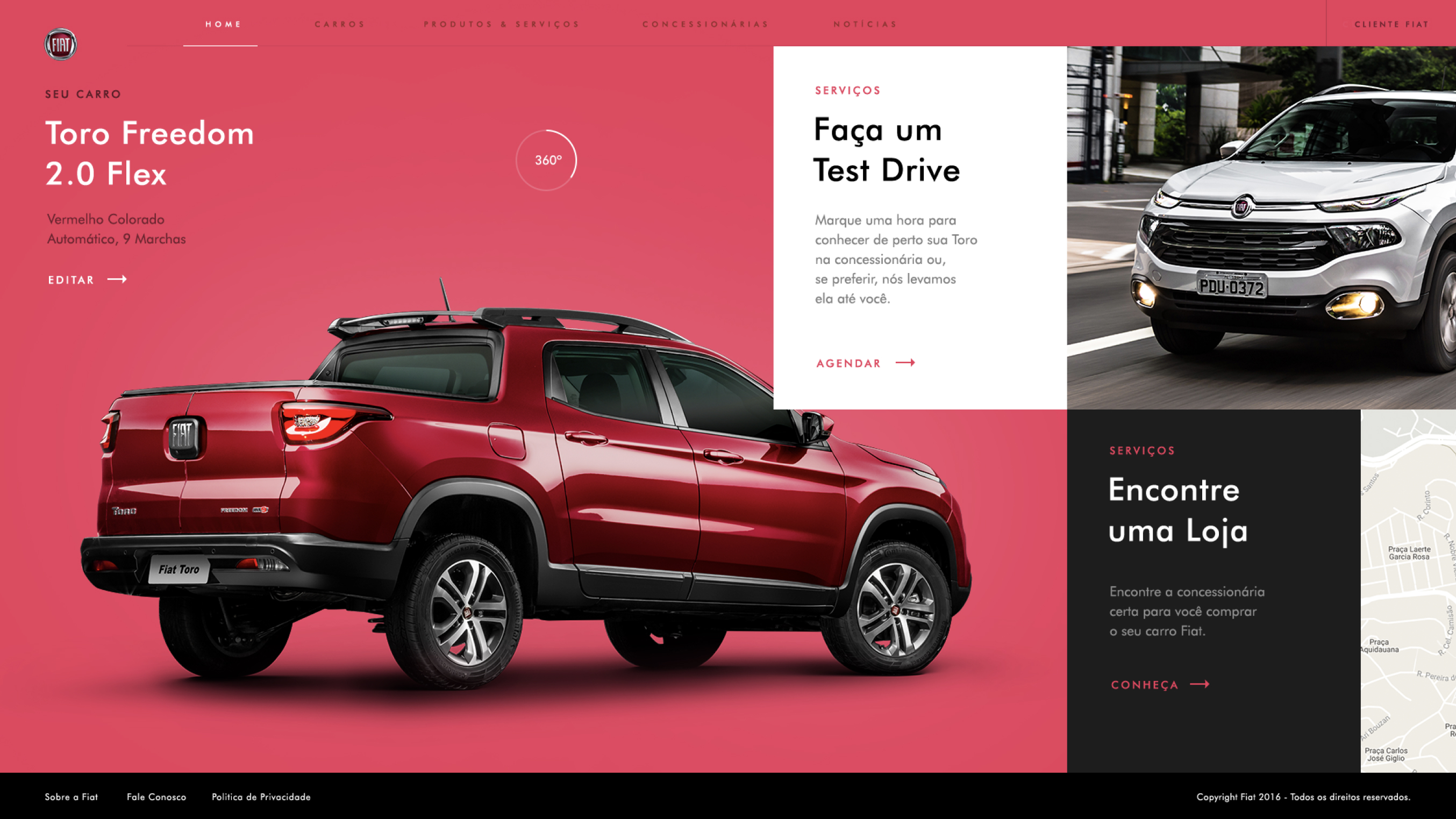
On the commercial site redesign, we created a personalized experience each time you acess the page, with an interactive 3d car exploration, horizontal navigation that brings the essential services focused on customer attention.
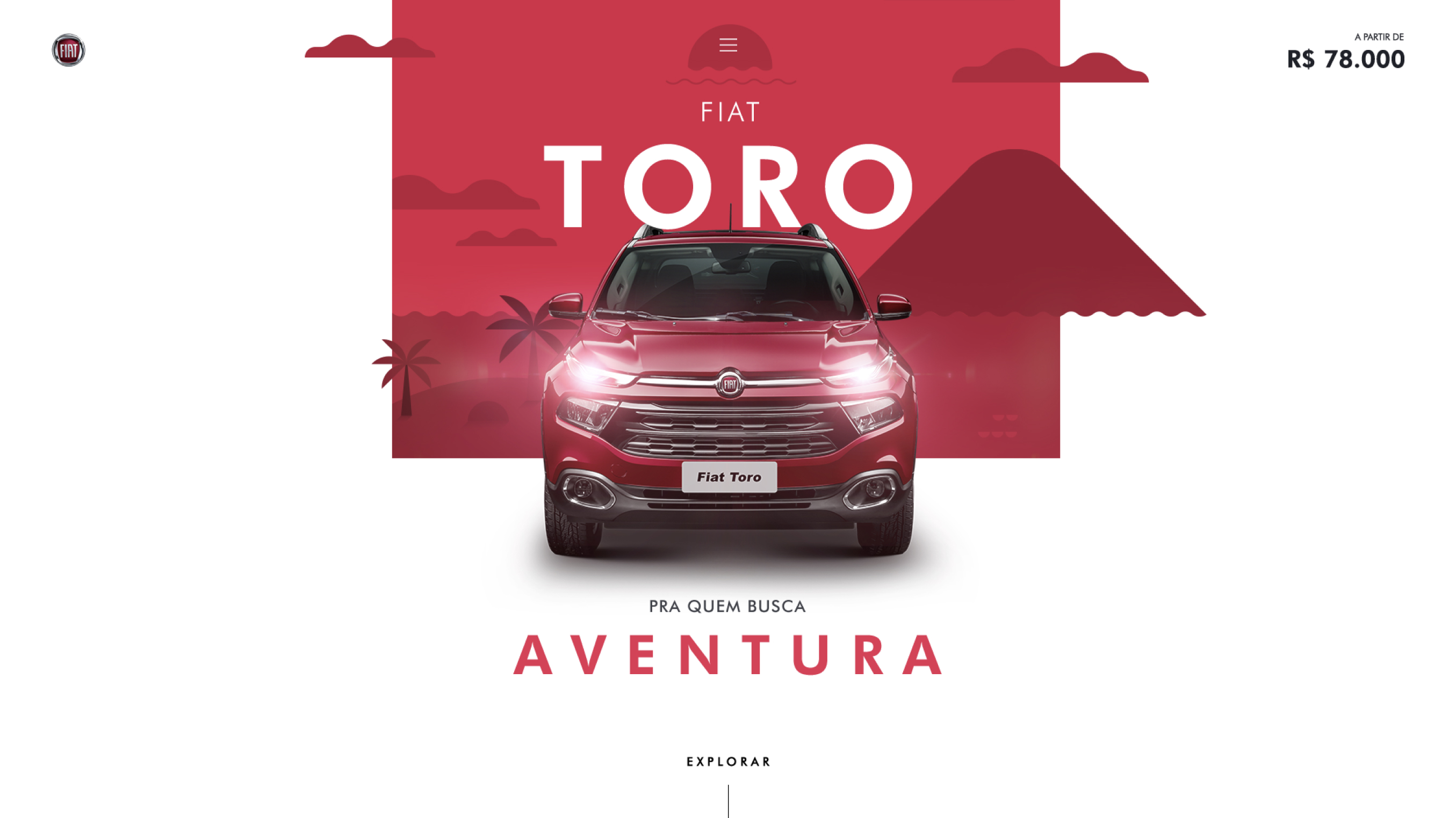
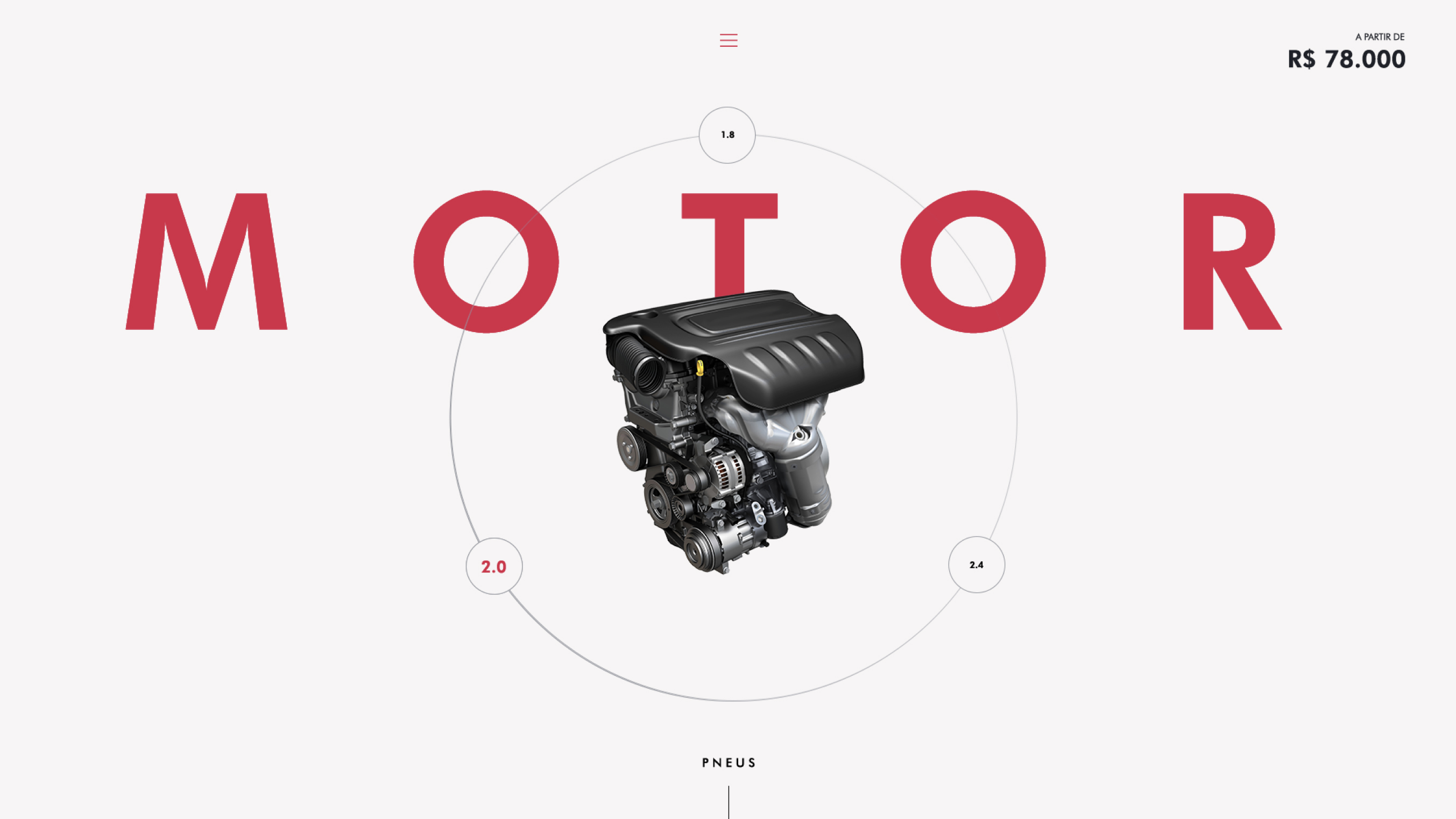
Product pages featuring each car by lifestyle, with an explorative mode when the user can check and explore all the car pieces and features, customizing his car.
An interactive video call with one of FCA experts, when the employee guides the user bringing relevant links and information on the screen for the user to see and chose, schedule his trip to the store, and much more.
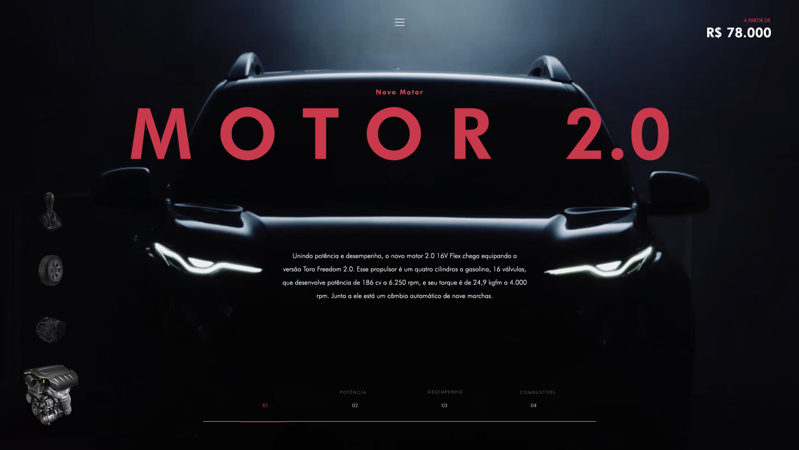
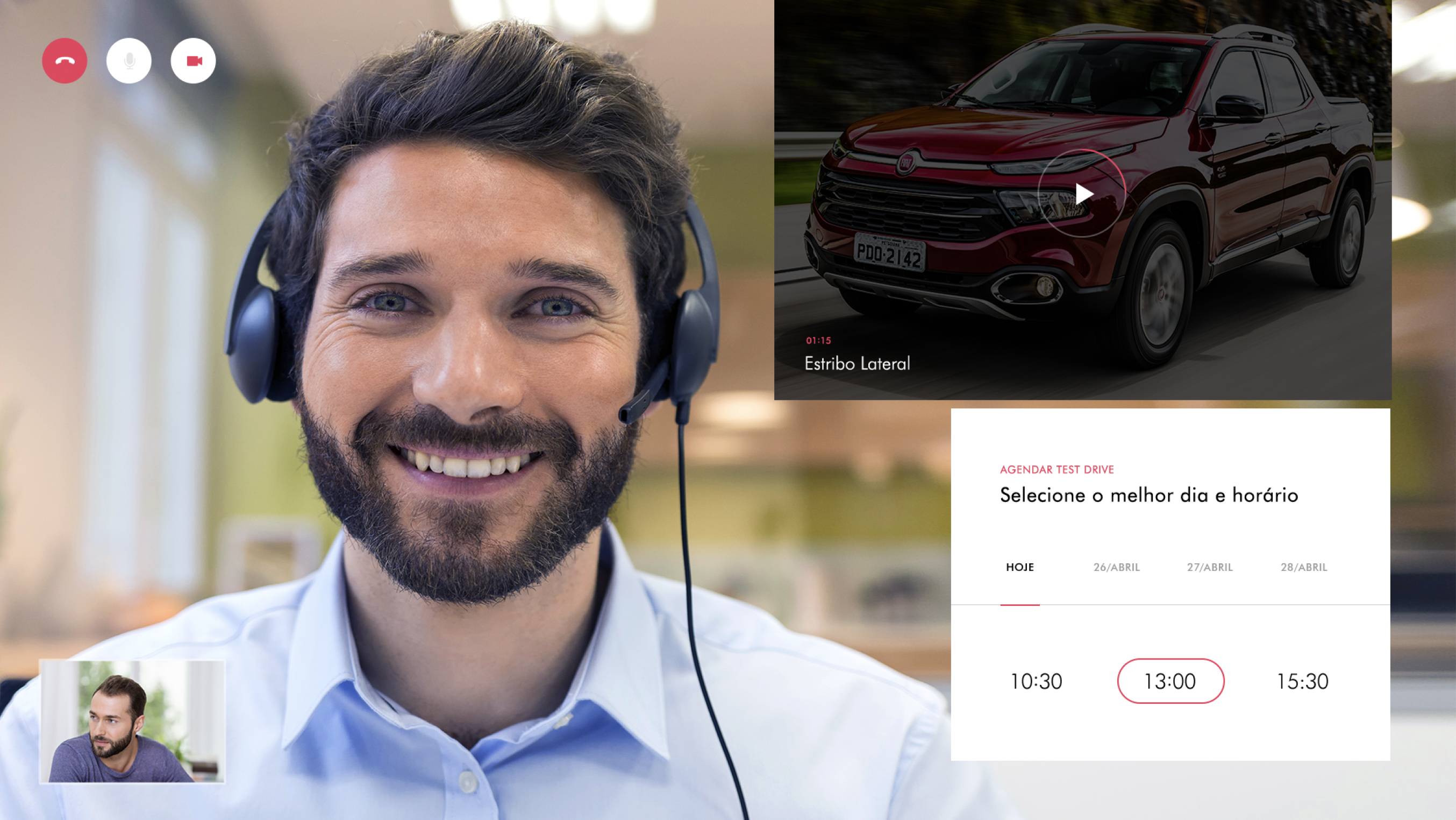
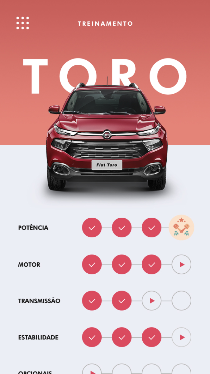
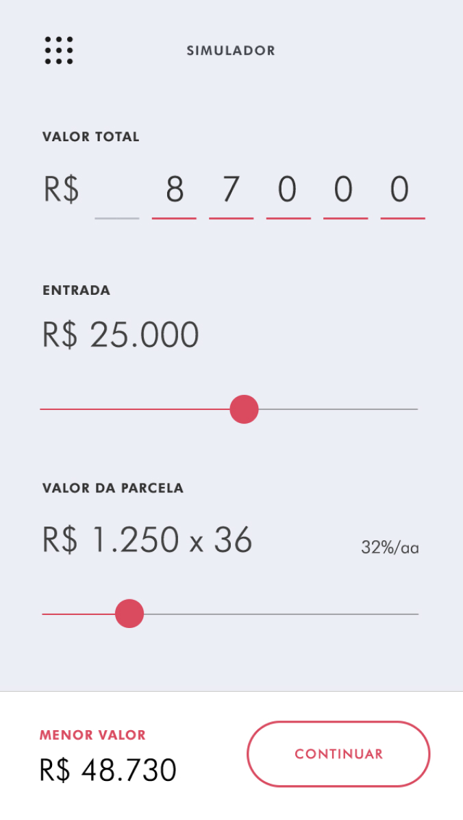
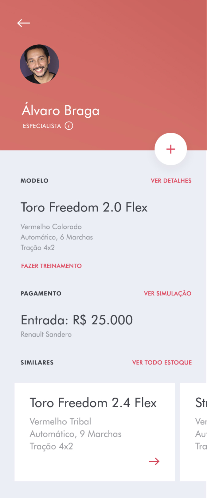
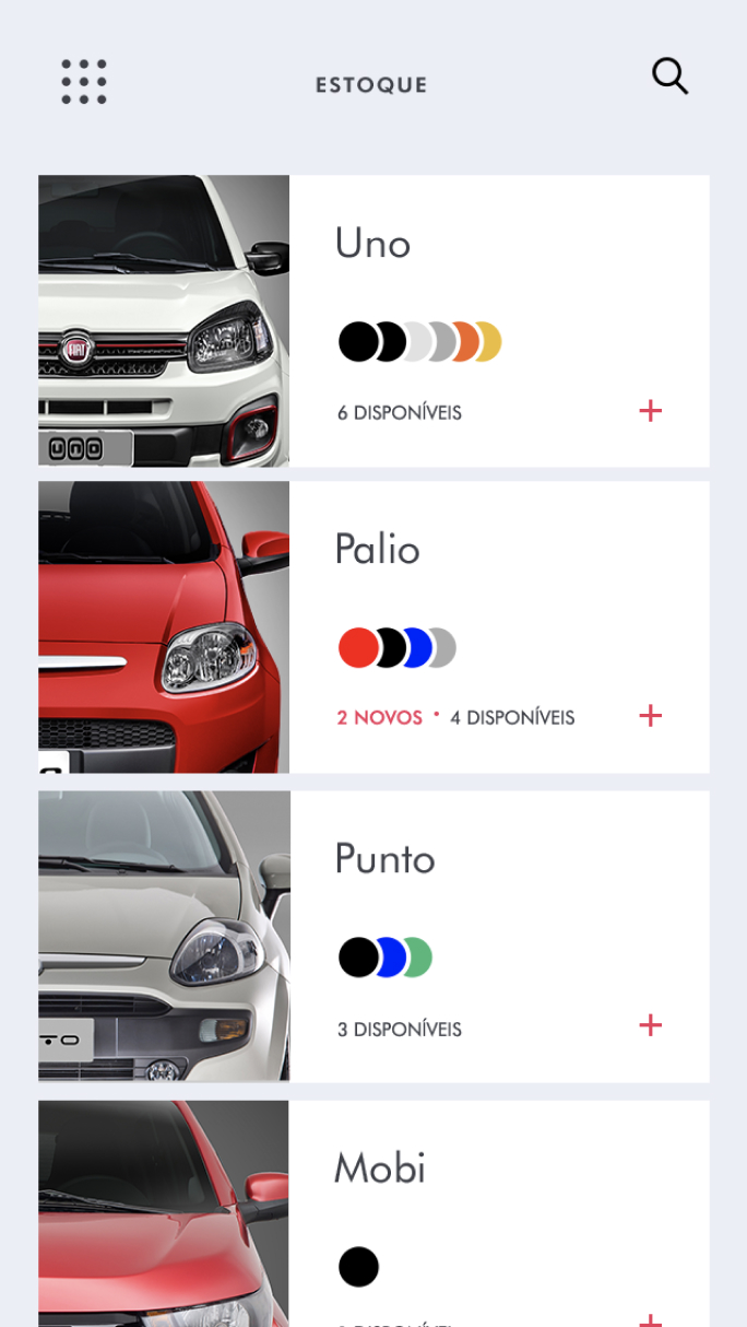
The salesman receives on his app, all the information requested by the user on the video call, so he is 100% prepared for when he arrives at the store. A profile of the user with all the information, his preferences, and car elections he made on the hand of the employee.
We give the employee a training session based on the doubts of the user, plus simulation tools so he knows exactly what to offer and how to close the deal, making the user, the brand, and the employee happy on the end.
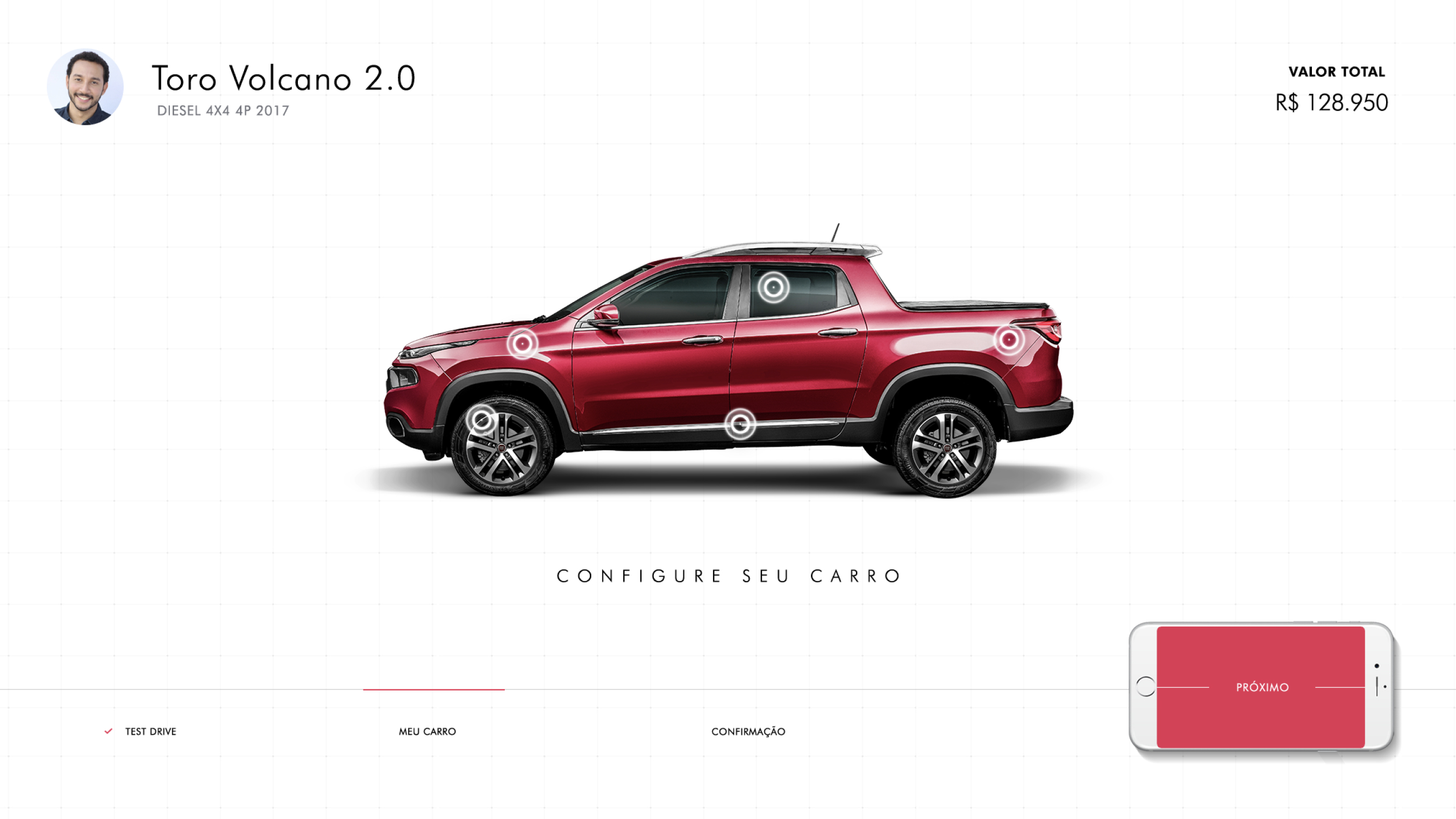
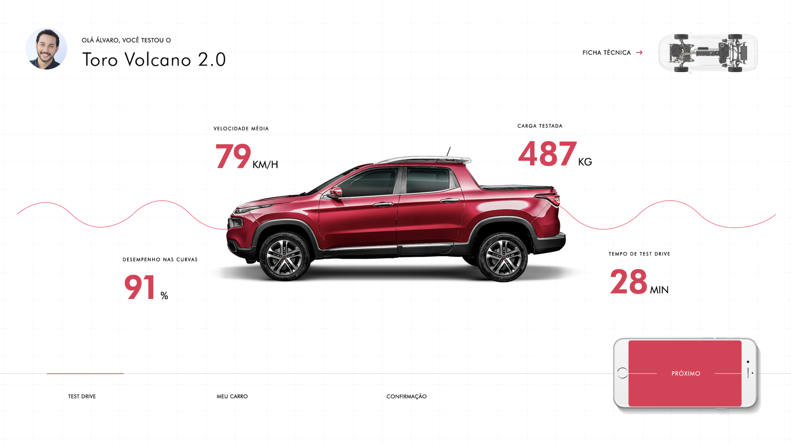
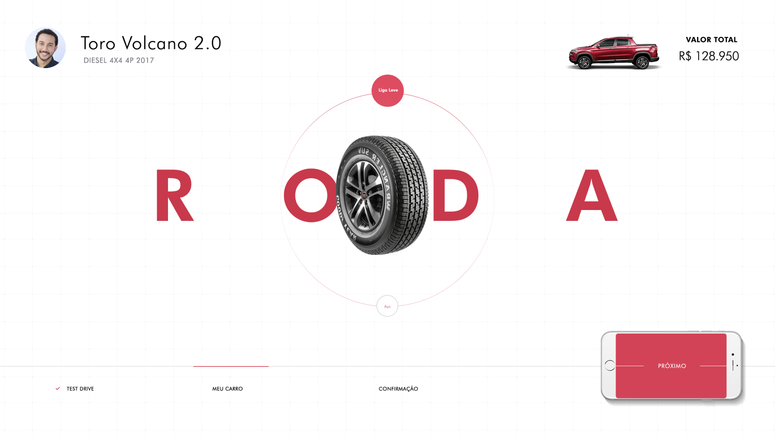
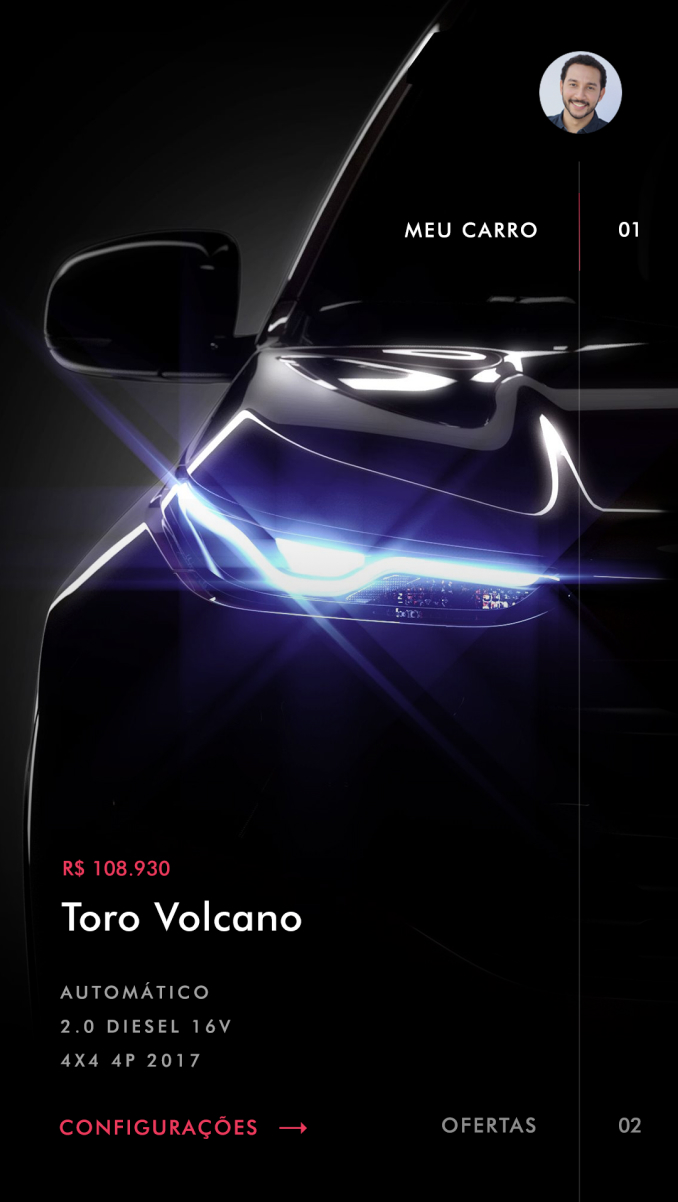
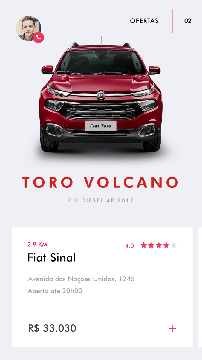
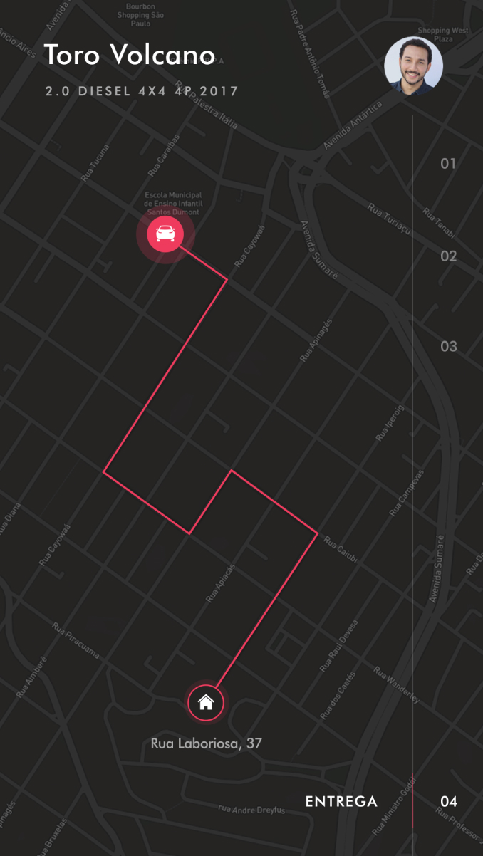
We also created a PWA for the buyers. They can see in real-time his car been manufactured, have some offers, training, and tutorials about all the vehicle features and a GPS delivery of the car itself.
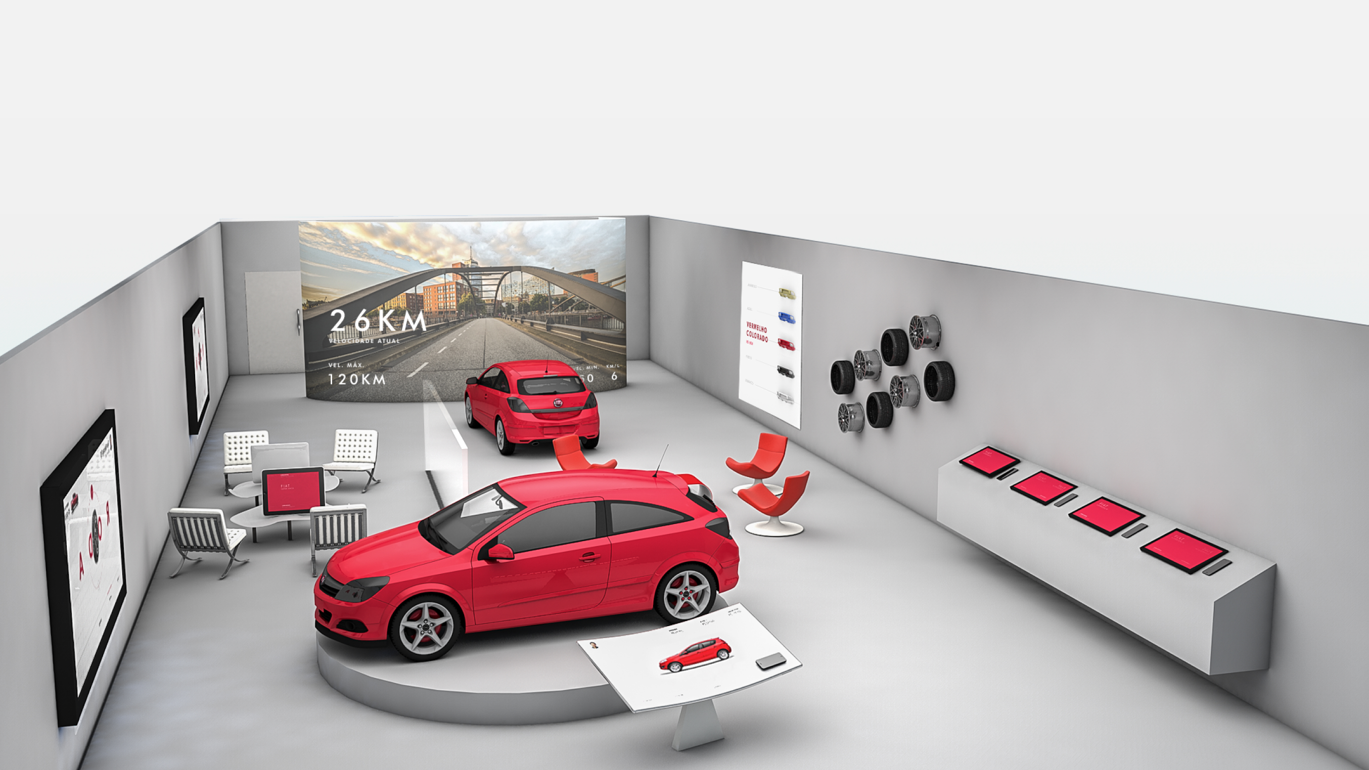
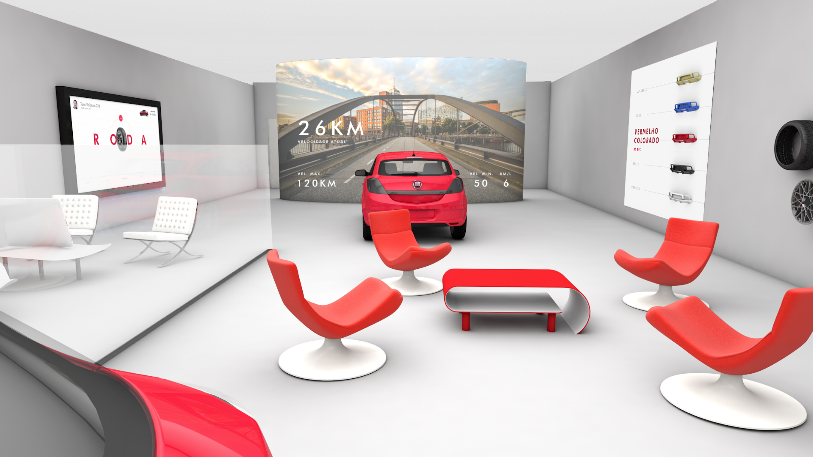
We re-imagined the physical store, making it more digital. The users can do a half-drive simulation inside the store, testing motor, sound, and feeling of the car.
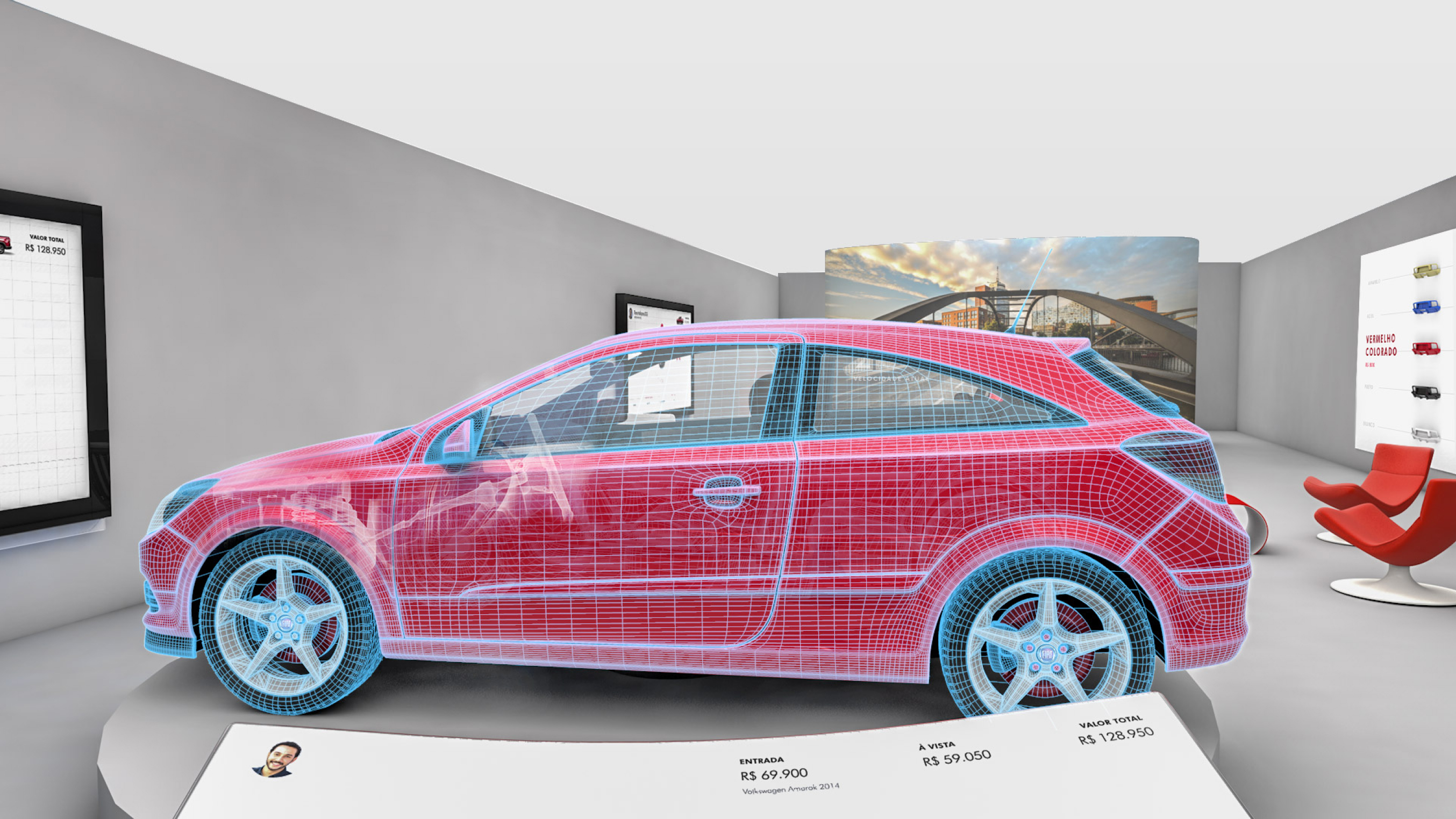
Using 3d technology and mapping projection, on an interactive totem, the user can discover more about the cars with visual guidance from the forecast, highlighting where the parts of the car are inside of the vehicle and how they function.
We also created spaces so multiple customers can get attention simultaneously.
Big
screens with information about the brand and the cars are always visible, entertaining the
user has to wait on the line.
