K
a
d

- Architecture
- Digital brand
- Visual Design
- UX Design
- Content
- Prototyping
K
i
t
c
h
e
n
A
i
d
R
e
t
a
i
l
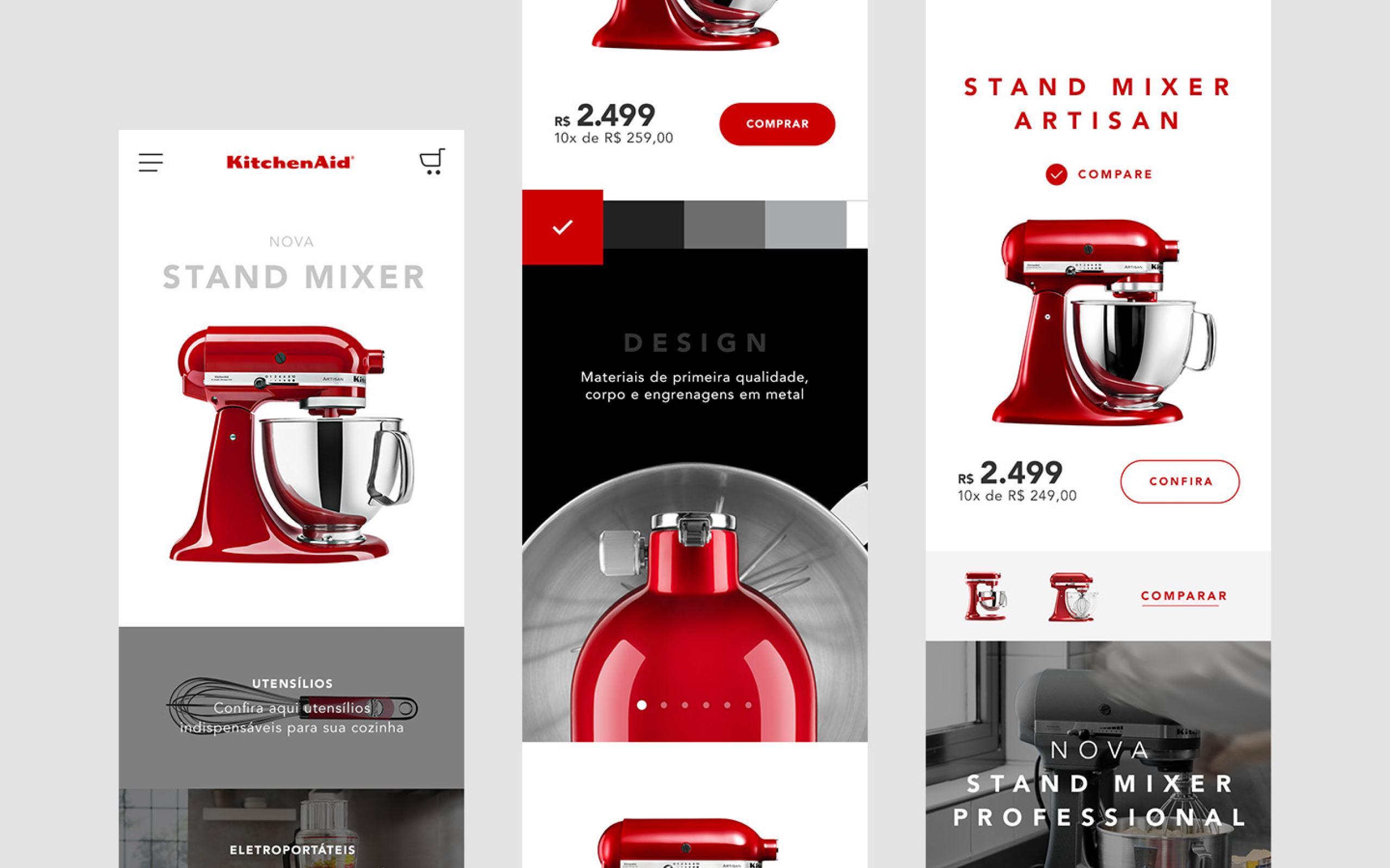
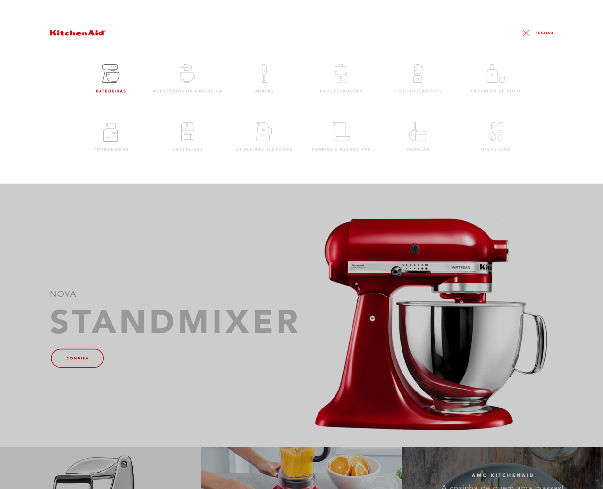
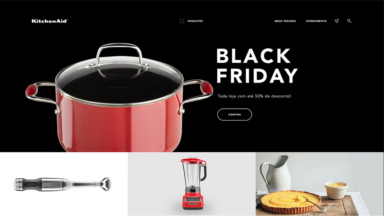
In 2016, the Whirpool group invited Huge to redesign KitchenAid's Brazilian portal, unifying the three sites of the brand (Ecommerce, Blog & Support) in one unique language.
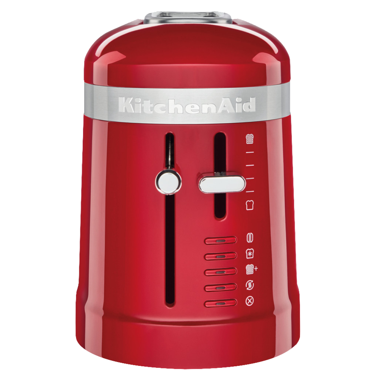
Our main goal was to emphasize their gorgeous products with a cleaner and minimal design, creating a balance between white space, beautiful photos, and solid typography.
Whether you cook, bake, brew, or blend, anything you want to do in the kitchen, you can do with KitchenAid.
Whether you cook, bake, brew, or blend,
anything you want to do in the kitchen, you
can do with KitchenAid.
V
i
s
u
a
l
D
e
s
i
g
n
We worked a few months to create a style unique, system design, and consistent user experience that works with a purpose in all e-commerce platforms. We design some flows, some design concepts, and some tests to arrive in a functional product.
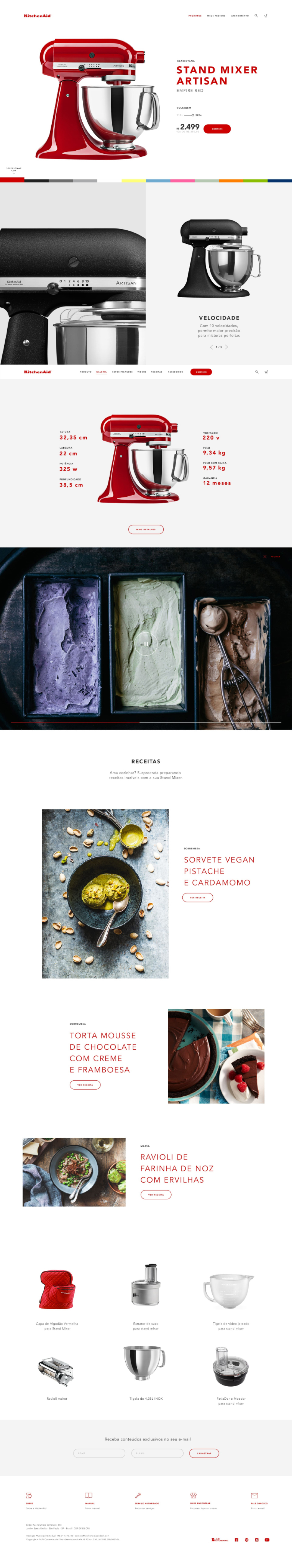
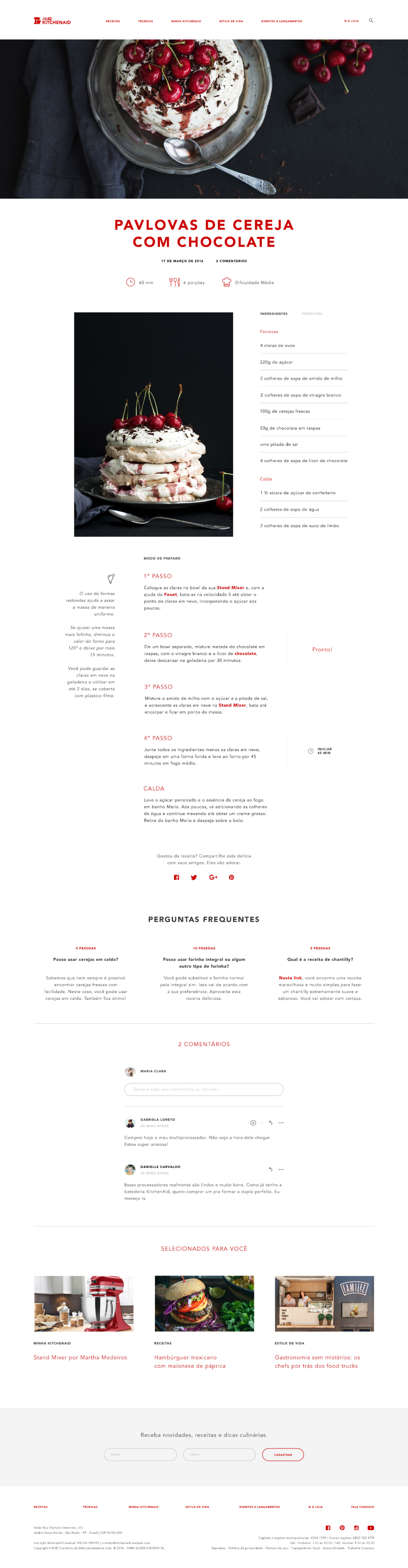
Unifying product information and specs with content related to that specific product like recipes, accessories, videos, etc... we try to inspire and inform the user at the same time.
C
o
n
t
e
n
t
We created a content strategy to improve the user experience with content, recipes, and storytelling about the product. We figure out that an e-commerce user experience around the KitchenAid’s content gives more power for the user choices.
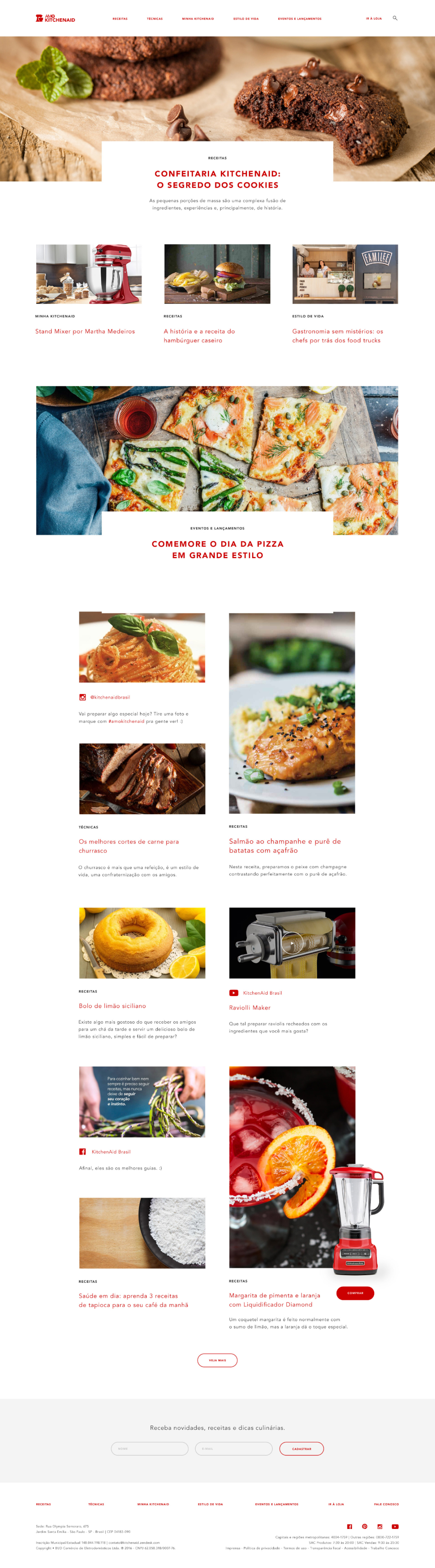
Features like a countdown that can be activated in the current step of the recipe are helpful tools for using your Kitchenaind product the best.
M
o
b
i
l
e
E
x
p
e
r
i
e
n
c
e
Focusing on creating an experience as good as a desktop on mobile we enhanced some features and changed some visual elements to better perform on mobile.